Designing brand identity can be one of the toughest missions for a Brand Manager or a Marketing Director. If you face this challenge, you’re in the right place. Whether you’re at the helm of an e-commerce giant, a burgeoning startup, or a retail business, a compelling brand identity isn’t just a ‘nice-to-have.’ It’s an absolute must! Branding is the cornerstone of your digital marketing efforts, the secret sauce that can distinguish you in a competitive industry.
Mastering the art of revamping your brand identity can elevate customer engagement and brand loyalty to new heights.

Now, let’s address the elephant in the room: the internet is flooded with free online software claiming to churn out ‘200 unique logo ideas in seconds!’ Sounds tempting. But let’s debunk this myth right now. While these tools may offer a quick fix for small projects, they are bound to fail to deliver an identity that’s genuinely unique and resonant with your brand’s core values.
Intrigued? We thought you might be. So, we’ve crafted this blog post to be your ultimate guide in creating a compelling brand identity that turns heads and wins hearts.
Understanding The Distinction Between Branding And Brand Identity
What Is Branding?
Ah, branding! The much-hyped buzzword in every marketing meeting, but let’s be honest, how many of us know what it means to ‘brand’ something?
Branding is the art and science of indelibility. It’s about making your mark, literally and metaphorically, in the crowded bazaar of consumer attention. It’s not just a logo, a snappy tagline, or a color scheme—although they are a part of it. Branding is like the soul of your company; it’s what people talk about when you leave the room. It’s your company’s reputation, corporate values, employee culture, and the feeling someone gets when they use your product or service. You want to be more than just a pretty face—you aim to be memorable, reliable, and worth committing to.
“If you are not a brand, you are a commodity. Then price is everything, and the low-cost producer is the only winner.” – Philip Kotler
Philip Kotler wasn’t mincing words. A brand is your protective shield in a marketplace that often turns into a pricing war. It adds value to your product that your competitors can’t match just by slashing their prices.

We’ll dive deep into the visual elements soon, but remember: a logo doesn’t make a brand, nor does a catchy jingle. Your brand is your company’s personality, moral compass, way of doing things, and how it makes people feel. It’s a complex puzzle that is solved by the marketing team and every person involved in the product, from conception to sales.
What Is Brand Identity?
Brand Identity is your brand’s wardrobe that contains all those tangible, eye-catching elements that make people say, “Ah, I know who that is!” It’s a critical chapter in the novel that is your branding, but it’s not the whole story. In essence, consider Brand Identity as the spice blend in the grand recipe of your brand. It adds flavor, distinctiveness, and a dash of swagger that sets you apart from the supermarket generic.

Here’s your toolbox of Brand Identity essentials:
- 🎨 Logo: Think of it as your brand’s selfie—a snapshot that captures your essence in a single visual swoop. It’s your first impression, your digital handshake, your calling card.
- 🌈 Color Palette: This is your brand’s mood ring, the set of hues that evoke emotions and perceptions consistently across every interface. Choose wisely; these colors are doing more heavy lifting than you think.
- 📝 Typography: Fonts and text styles are like your brand’s accent. Whether you’re going for ‘sophisticated British’ or ‘quirky millennial,’ your typography speaks volumes about your brand’s character.
- 🌟 Visual Elements: These unique artworks could be a signature pattern, a mascot, or custom icons—elements that enrich your brand’s visual story.
- 🗨️ Brand Voice and Tone: Imagine your brand at a cocktail party. How would it speak? What jokes would it make? That’s your brand voice—how you engage in conversations from social media banter to serious customer support.
- 💬 Slogan or Tagline: If your brand were a superhero, this would be its catchphrase. Short, punchy, and memorable—it sums up your brand’s mission and charisma in a nutshell. When you hear “Just do it,” you know perfectly what brand it refers to.
- 📦 Packaging and Stationeries: This isn’t just a pretty wrapping paper; it’s an experience. How your products look and feel in someone’s hands can be the tiebreaker in a crowded market.
- 📜 Brand Guidelines: Consider this your brand’s constitution—a set of iron-clad rules to ensure everything from your Instagram story to your email signature sings the same tune.
That’s quite a toolkit, right? But remember, all these elements must march to the beat of the same drum: that’s your overall branding!
How To Nail Your Branding In The Social Media Era?
Let’s introduce a term here: Brand Consistency. This concept encapsulates the presentation of a unified, professional, and cohesive brand image across all platforms and touchpoints.

Imagine every reel, every story, every post like a Lego block. When the colors match, and the style fits, you build something more than just eye-catching; it’s memorable. Think about that fantastic Coca-Cola red or Apple’s minimalist chic. These brands are nailing it not just because they’re everywhere but because they’re consistently themselves everywhere they go.
Muhtar Kent, with his experience as the CEO of Coca-Cola, said:
A brand is a promise. A good brand is a promise kept.
Your brand identity is that promise that makes folks stop scrolling and start engaging.
Gone are the days when a brand broadcasted its message from the mountaintop and waited for the masses to gather. Social media has turned that monologue into a full-blown, round-the-clock dialogue. Traditionally, branding was a one-way communication channel: Brands spoke, and consumers listened. Social media has turned this dynamic on its head by allowing consumers to talk back. This interaction requires a more flexible and adaptive approach to branding, where consumer feedback can and should shape brand identity over time.
Another essential point is that in the age of social media, consumers can smell inauthenticity from a mile away. A poorly considered post can go viral for the wrong reasons, fragilizing your brand positioning in the blink of an eye. On the contrary, brands that “live” their online and offline identity and ethos are rewarded with consumer trust, which is more valuable than ever.

Tips To Create Visually Appealing And Memorable Brand Identity Elements
Increased brand recognition is one of the most essential advantages of brand consistency in digital marketing. You can establish a robust and identifiable brand identity that stands out in a crowded digital market by employing consistent colors, fonts, logos, and messages across all mediums. Use the same color palette, typography, and design elements to create a cohesive and unified brand identity.
Therefore, designing the logo and other brand elements is essential for creating a solid brand identity that resonates with your target audience. Investing time and effort in creating captivating and meaningful designs will help build a strong brand identity and leave a positive and lasting impression on your audience.

When choosing a logotype, consider your brand’s personality, target audience, industry, and long-term goals. Choose colors that align with your brand’s personality and evoke the right emotions in your audience. Typography is crucial in conveying the brand’s tone and personality, so select a font or typeface that complements your brand’s style.
Knowing color theory, logotypes, and principles of logo design can help your business to have a captivating brand identity.
Understanding Colors as Powerful Vectors of Emotions
We’re about to take a technicolor journey through the rabbit hole of brand identity elements. Don’t underestimate the psychological magic of a well-chosen palette, but let’s not get ahead of ourselves: this isn’t some paint-by-numbers affair!
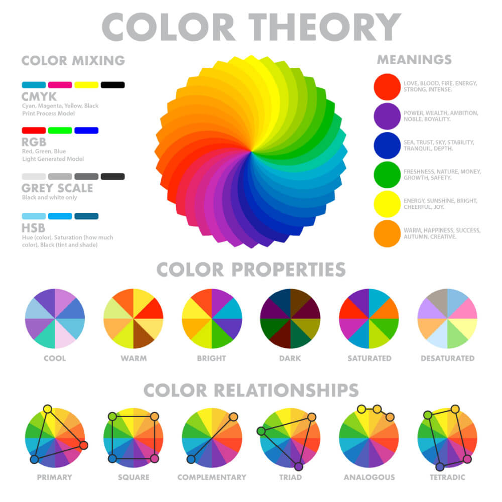
This is about strategically wielding colors to make your brand not just seen but genuinely unforgettable. And remember, we’re talking Western color theory here—so if your target market extends to places like Asia, where the color spectrum resonates differently, you’ll need a different playbook. But that’s a tale for another time; let’s dive in.
- Red: This is the adrenaline junkie of colors, always up for inciting a little action. In the Western realm, red screams power, passion, and ‘Get up and go!’ It’s the siren call for making bold moves. Perfect for call-to-action buttons or any messaging that requires immediate engagement.
- Orange: the sprightly spirit of the color wheel! Orange speaks the universal language of joy and enthusiasm. This is the go-to hue for brands that convey friendliness and approachability while packing a high-energy punch.
- Yellow: This isn’t just the color of sunshine; it’s the hue of intellect and happiness. But overdo it, and you risk overwhelming your audience. Use it as an accent color to light up particular points, draw attention, and spread a little cheer.
- Green: Now, here’s a color that wears many hats. In the Western context, it’s the guru of growth, synonymous with sustainability and ambition. It tells your audience that your brand is flourishing. Whether you’re in financial services or promoting eco-friendly products, green’s versatility is its hallmark. But if your brand is rooted in countries with Islamic communities, green isn’t just any color; it is sacred. It’s considered the color of paradise, adorning the heavenly in Islamic tradition.
- Blue: The epitome of calm, cool, and collected, blue’s varying shades offer a gamut of possibilities. Lighter shades promise peace and tranquility, while deeper hues exude unmatched authority and confidence. Ideal for brands aiming to convey trust and reliability.
- Purple: Purple whispers luxury, exclusivity, and a touch of creative flair. It’s not for everyone; it’s for the discerning ones, making it perfect for high-end and specialty brands.
- Black: The James Bond of colors—sleek, mysterious, and universally cool. Black gives your brand an air of sophistication and modernity. Yet, it’s a classic, capturing attention but never begging for it.
- White: The ultimate minimalist, white creates a clean slate. In Western culture, it represents purity, safety, and clarity, allowing your other branding elements to pop truly. It’s your canvas, your breathing space amid visual noise.
Types of Logos
- Wordmark (Logotype):
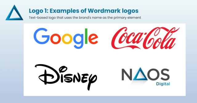
A wordmark is a text-based logo that uses the brand’s name as the primary element. The design focuses on typography and often incorporates unique fonts, lettering, and stylization to create a distinct visual identity.
Examples include Google, Coca-Cola, Disney, and, in our case, NAOS Digital.
- Lettermark (Monogram):
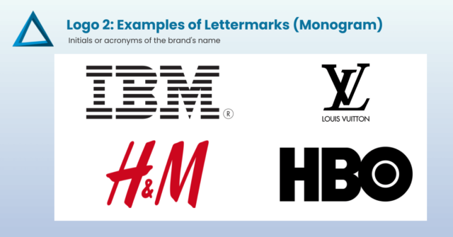
A lettermark logo comprises the initials or acronyms of the brand’s name. It simplifies the design to the essential letters and is particularly useful when the brand name is long or challenging to remember.
Examples include IBM, HBO, and Louis Vuitton.
- Brandmark (Pictorial Mark):
A brandmark logo is a visual symbol or icon representing the brand without using text. These logos use a simple yet memorable image to convey the brand’s identity.
Examples include the Apple logo, Nike’s swoosh, McDonald’s, Starbucks, Mastercard and the Olympic Games.
- Combination Mark:
A combination mark logo combines text and a visual symbol/icon. The brand name is integrated with a unique graphic element, offering flexibility and recognition. Examples include Tesla, Microsoft, WWF, the AUC, Fawry, Jumia, and Juhayna.
- Emblem:
An emblem logo features text enclosed within a shape or symbol, creating a unified design. Emblems often have a traditional and authoritative feel and are commonly used by government agencies, universities, and sports teams.
Examples include NASA, Orange, Harvard, Peugeot, and Harley-Davidson.
Principles of Unique And Recognizable Logo Design:
- Choose an easy-to-read font.
- Keep it clean and simple.
- Avoid using too many colors.
- Select a color scheme that works well together.
- Ensure your logo and brand assets adapt to different backgrounds.
- Avoid trendy elements that might quickly become outdated.
Brand Evolution: A Showcase Of Successful Redesigns
Airbnb
In 2014, Airbnb underwent a significant rebranding, moving away from its original “Airbnb” wordmark and introducing the “Bélo” symbol. The new identity aimed to represent “belonging” and “hospitality.” The redesign was widely praised for its simplicity and versatility.

KIA Automotive
In 2021, this Korean carmaker decided to design a dramatically different logo. The slogan was also changed (now it’s “Movement that inspires”), as well as the company’s name (KIA ditched the word “motors” from the name to show a full-on transition into electric mobility). As the company’s CEO, Ho Sung Song, put it:
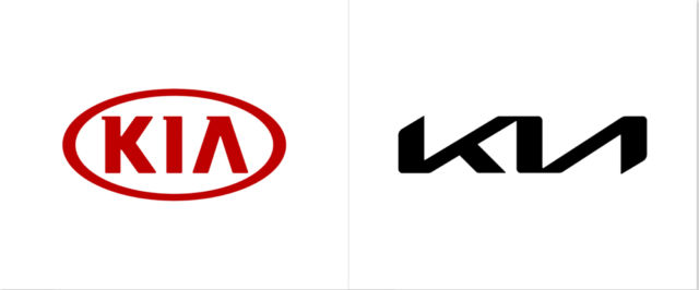
“Kia’s new logo represents the company’s commitment to becoming an icon for change and innovation.”
Peugeot
In the ever-evolving landscape of automotive branding, Peugeot’s 2020 rebranding is a case study in deftly balancing heritage with innovation. Celebrating its 210th anniversary, Peugeot is no stranger to the art of reinvention; as proof: the recent unveiling of its 11th logo since 1850. This rebrand is not merely cosmetic; it’s a critical part of Peugeot’s broader transition towards electrification. Operating under the Stellantis umbrella, Peugeot wants to position itself in the ‘Upper Mainstream’ segment, just below the premium allure of Alfa Romeo and DS Automobiles.
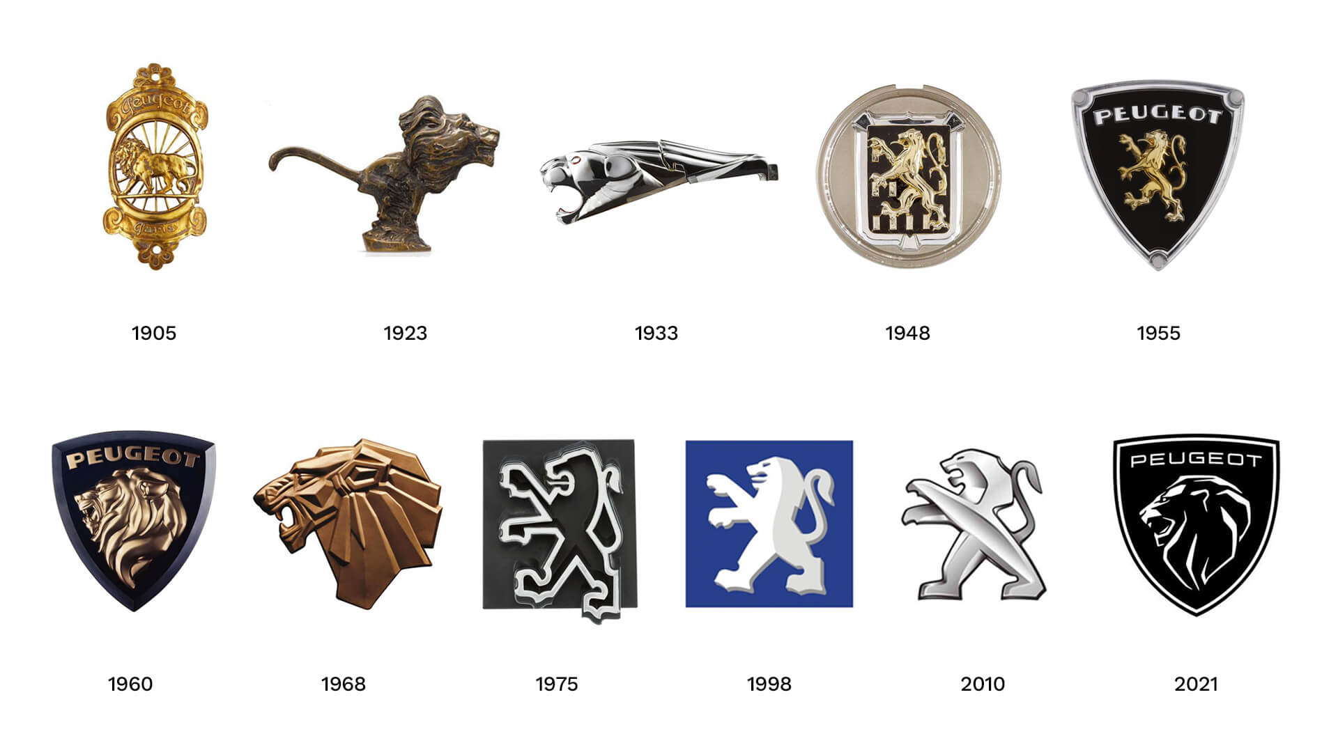
The rebrand brings a modern twist to a retro design language, celebrating the ‘concept of time’ and ‘living in the moment’. Mathieu Riou Chapman, director of Peugeot Global Brand Design, emphasized the immense heritage of the iconic lion in their logo, and the importance of retaining it. The redesigned emblem evokes a sense of timeless resilience, drawing inspiration from a coat of arms and giving prominence to a roaring lion’s head, symbolizing power, strength, and confidence. By nodding to its 1960s logo while simplifying it for the modern eye, Peugeot crafts a visual identity that speaks to its storied past and electrifying future.
Dunkin’ (formerly Dunkin’ Donuts):
In 2018, Dunkin’ Donuts simplified its brand identity, dropping “Donuts” from its name and using a more modern font and color scheme. The rebranding aimed to focus on its broader offerings beyond just donuts.

Spotify
In 2015, Spotify refined its logo and added bright, vivid colors to its brand palette. The new design was praised for its vibrant and contemporary feel.

Ultrabrands: Exceptional Brand Identities Examples
Many case studies demonstrate the importance of solid and consistent visual brand identity in establishing a company’s presence, fostering brand loyalty, and driving business success.
Here are some case studies of companies with effective visual brand identities:
- Apple: Apple is a prime example of a powerful visual brand identity. Its minimalist and iconic logo, featuring an apple with a bite taken from it, is instantly recognizable worldwide. The clean design and consistent logo use across all products and marketing materials have contributed to Apple’s strong brand recognition and loyalty.
- Nike: Nike’s “swoosh” logo is one of the most famous and enduring brand symbols. The logo’s simplicity allows for easy adaptability across various media and applications. The visual brand identity reflects Nike’s focus on innovation, athleticism, and empowerment, making it one of the most influential and successful sportswear brands globally.
- Coca-Cola: Coca-Cola’s visual brand identity is deeply ingrained in pop culture. The classic script font and distinctive red color have remained consistent for over a century. The brand’s ability to evoke happiness, nostalgia, and togetherness through its visuals has contributed to its enduring success.
- Google: Google’s visual brand identity is synonymous with simplicity and approachability. The use of vibrant primary colors and a clean, sans-serif font in its logo conveys the brand’s commitment to innovation and user-friendliness. The brand’s consistency across its various products and services has contributed to its dominant position in the tech industry.
How to Kill a Brand
July 2023 witnessed an extraordinary development in the branding universe when Elon Musk audaciously rebranded Twitter to X. This seismic move sidelined the iconic blue bird and the well-established Twitter brand, essentially throwing conventional branding wisdom to the wind. Helen Edwards, a leading voice in the marketing world and the director at Passionbrand, astutely observes that the rebranding lacks “no best practice branding logic” to the move, especially since Twitter had already achieved the holy grail of branding: the brand name to become a verb.
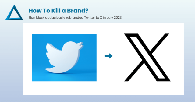
Analyzing this from the angle of logo change management, Edwards critiques the rollout as very amateur, citing inconsistencies across various interfaces.
She foretells that the rebrand might be short-lived. Either it falls flat, prompting users to stick with the original ‘Twitter’ moniker, or it proves to be an expensive and elaborate ruse by the audacious entrepreneur. Either way, this case offers a cautionary tale for any brand contemplating a dramatic transformation.
Conclusion
Revamping a brand’s visual identity is not just an exercise in aesthetics; it’s a pivotal business decision that can dramatically affect your market position, customer engagement, and overall brand equity. From understanding the intricate relationship between branding and brand identity to leveraging the power of color theory and logo design, this guide has aimed to be your comprehensive playbook for mastering the art of branding in the digital age.
It isn’t just about having a logo; it’s about forging a symbol that, with its design and resonance, challenges time itself. This is the apex of brand identity, the magnum opus of a brand’s narrative, where design meets destiny. So, if your aspiration aligns with this lofty vision, if you’re on a quest for that indelible mark that will stand as a beacon through the decades, know that you don’t have to embark on this journey alone.
At NAOS Digital, we help brands like yours navigate the ever-changing tides of the branding world. We don’t just create logos; we craft legacies. So, if you’re prepared to step into the future with a logo that remains rooted in the annals of time, you should contact us!

